Modernist Poster
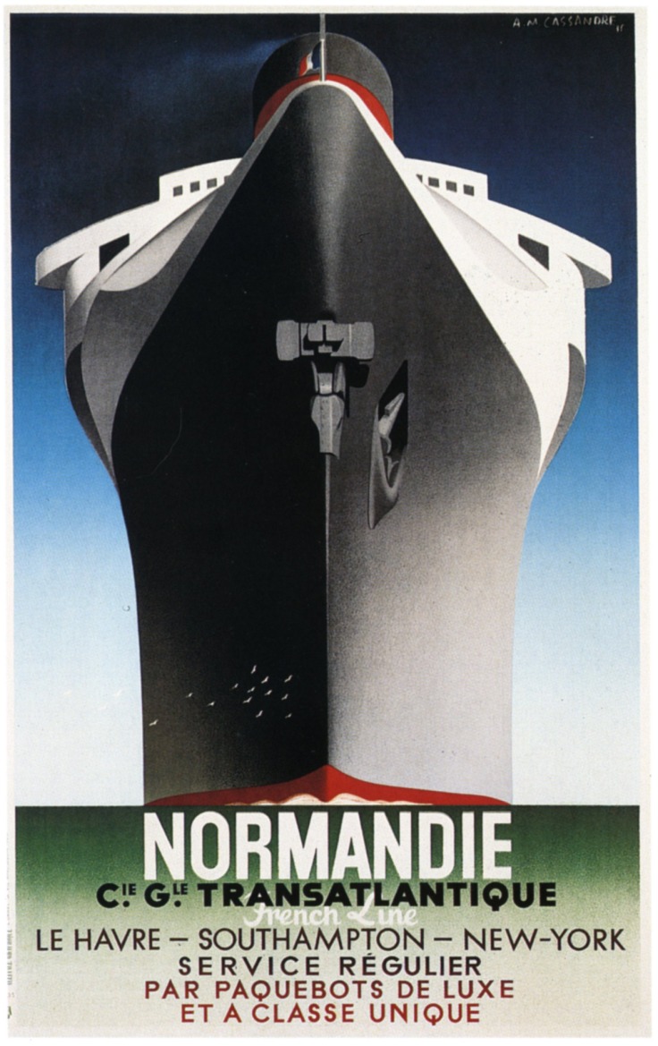 So for the first part of task 1, I have chosen this Modernist poster which was made by Adolphe Mouron Cassandre and it was made at about 1930s to 1940s which was a long time ago before there was tools to make posters digitally. So from what I see, the artist probably used the technique called air brush and print, which were one of the most used techniques by the time. The artist would have had to put colours in layers in order to get gradients and he used airbrush technique to get most of the gradient colours of the sky, the ship side shadows. The way the ship is placed make you feel small as it looks much taller and bigger than you are and that also helps to grab peoples attention as by the research people watch at the poster for average of 3 seconds and you need to say what you want to say. And that immensity really helps to get that attention that you need for people to read the message. So i think that the message that this poster is conveying is that this ship is very glorious and that if you’re travelling to Southampton or New York, you should definitely travel with this Ship, as it looks ‘Unsinkable’ and very fast.
Post-Modernist Poster
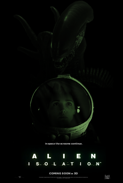 As this is one of my favorite games of all times and I would love to see a movie based on the game and not the older Alien films. That’s why I have chosen this poster. The poster is of course a post modern poster as it was made after the 1980s, and because the game only came out in 2015 I would say it was made in 2015 or late 2014. This poster was made using computer because as we can see there are effects that would be hardly possible to make without the technology that we have today. The techniques and tools used in this poster were mostly Photoshop, maybe some Illustrator and probably a bit of Cinema 4D as the helmet of the space suit probably had to be made up to make poster more realistic as there are not much sources with quality content that could be used for this poster. But in order for the designer to achieve this level of detail, the artist have used quite few digital design tools such as layers, blurring, block colour fillings, gradients, masking and much more other tools. For example, the artist used gradient colours all over the helmet because the lighting is being so low, the colours get darker really suddenly around the corners and that means that the darkening needs to be gradient so it makes it look nicer and more neat, he also may have used masking tools to get the colours of the various parts of the poster where he needed, for example he may have used masking tool for the text which is I think made up from scratch and isn’t a specific font, he may also used it to put the person in the suit/helmet, as the helmet had to be rendered digitally and the person was photographed in real life. The layers however were used to make the person look like he is actually in that suit/helmet and that makes the poster look more realistic and more attractive to the eye as people like to see professional and good looking pieces of art and design rather than poorly made posters and designs. The artist probably have used the blur tool on the glass of the helmet to make the reflection look more realistic as real life reflections tend to be unfocused and blurred for human eye or camera if they look at the right angle. This effect also added more professional look and also some interest factor as people may want to try seeing what is in the reflection and this may cause longer attention time which means people will have a better look at the poster and even if they were unable to, they will probably to it when they get back home and look at the poster closely, which also means they may share it if they like it and this causes bigger group of audience is being attracted to see this movie. The designer may have had the color swatch pallet open as he may have used it for background, which seems to be absolutely dark but to know that for sure we would need screens with really accurate colour reproduction. But anyways, the designer of the poster may have used different block colour fills by using the swatches to choose from the needed colors, and he may have used really dark colours for that which may have made an affect of deep space as there are areas in space which aren’t completely darkness, and as the game and the movie are set in space, this makes absolute sense to do. The poster conveys a message ‘In space the screams continue’ which really reflects a big par of the game which the movie would probably be based from, and it also makes the viewer to feel the terror of being in the spaceship surrounded by aliens where nobody can hear you scream and the word ‘continues’ just confirms that if you can’t save yourself you’re screwed. The darked out part of the poster also makes it more terrifying as you don’t know what may come out of the darkness or what may wait for you there. The green tint of light also represents the colour which is strongly used in game and in older movies as it represents the colour of aliens and that they are very mysterious. The glitches on the text also gives an impression that there will be a lot of glitches in the movie as there is a lot of them in game because the game and probably the movie themselves are based in 1970s or 1980s as the technology used in the game looks familiar to those who were using it during that period.

Leave a comment